Website Design & Graphic Design at Neighbourlink North York
In my two-month contract with Neighbourlink North York, I worked as the website designer. In my job, I evaluated the website against usability principles, proposed new design, and implemented changes to over 50 website pages to make the website look more modern, clean and user-friendly. I also redesigned the annual report template and event sponsorship decks.
The company
NeighbourLink North York is a locally based Christian community development organization. Its mission is to engage and empower neighbours to care for each other in practical, relational, and sustainable ways that allow everyone to live out their potential.
The organization's goal is to expand programs and services that reduce social isolation, alleviate food insecurity, address community gaps and empower vulnerable populations—such as seniors, single mothers, and individuals with disabilities—by coming together to build a strong volunteer network, increase community partnerships, and enhance local resources
Responsibilities
-
Conducted usability evaluations and hosted stakeholder consultations to enhance website design.
-
Redesigned nearly 100 web pages using Wix and Figma, significantly improving user experience and engagement
-
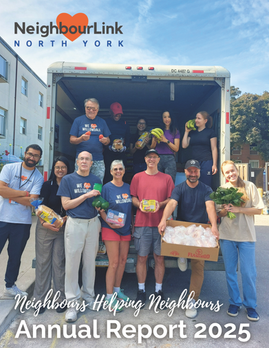
Revamped the Annual Report template and Event Sponsorship Decks, elevating aesthetic while preserving brand identity
Tools
-
WiX
-
Figma
-
Canva
-
Microsoft Word
Before and After Design Highlights
Homepage
Before

-
Unstructured layout
-
Too many colours
-
Lack of visual balance
After

-
Clean and modern layout
-
Only necessary colours
-
Balanced and straight to the most important content
Volunteer
Before

-
Lack of clear structure
-
Buttons with no guidance; confusing for new users
After

-
Clear guidance for registration
-
Perfectly aligned content
Ways to Give
Before

-
Hard on the eyes
-
Low readability/accessibility
After

-
Easy to read
-
Modern layout
Donate
Before

-
The website header picture is not powerful enough
-
No highlight of "why should we donate the money to you"
After

-
More powerful header image (showing 30 years of history)
-
Highlighting recipients' quotes to demonstrate good service and encourage donation
Program Area Overview
Before

-
Confusing colour choices
-
Low readability/accessibility
-
Not Interactive
After

-
More detailed descriptions
-
Call-to-Action buttons
-
Easy to read
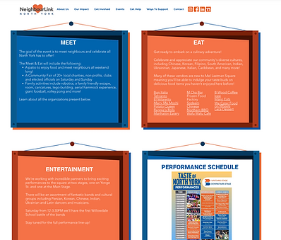
Event Description Page
Before

-
Low readability
-
Outdated frames

-
No empty space within the tag
-
Texts are too small to read
-
White texts on orange background are not accessible
After

-
Easy to read
-
Modern and eye-catching

-
Easy to update information
-
High readability
Sponsorship
Before

-
Lack of clear structure
-
Lack of white space
-
Cannot differentiate between different sponsors
After

-
Plenty of white space
-
Easy to differentiate between different sponsors
Youth Programs
Before


-
Too many texts
-
Do not know where the highlights are
After


-
Standardized headings
-
Highlighted important content
-
Organized in a logical way
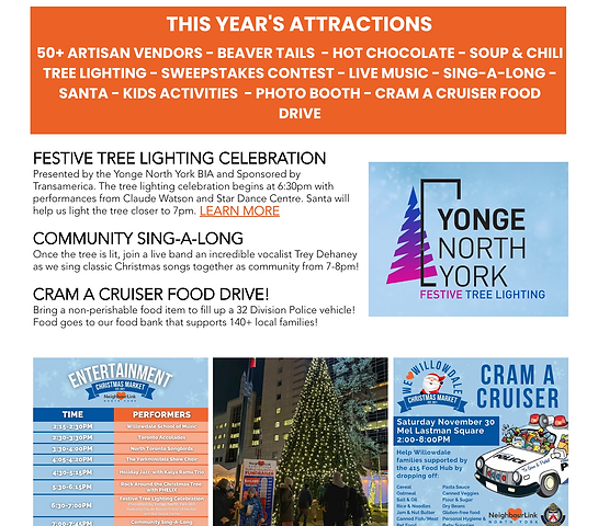
Christmas Market Page
Before

-
Hard to get key information
-
Information is not chuncked in a reasonable way
After

-
Easy to get key information
-
Texts and pictures were structured logically
Mobile Optimization
Before


-
White gaps between content
-
Not showing all the content on mobile
After


-
Optimized for mobile experiences
-
Everything works fine, just like the desktop version of the website
Please feel free to check the whole website at: https://www.neighbourlink.org/
Graphic Design Work


